Information Overload
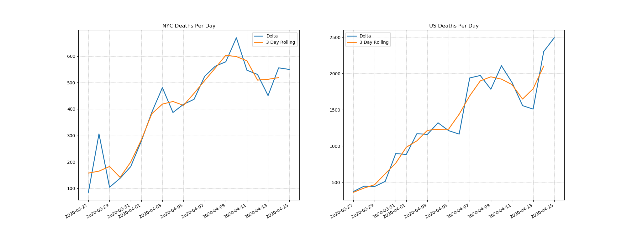
In the past couple of weeks there has been an information overload with regards to how the world is handling Covid-19. There are lots of arguments how the number of cases is biased towards the amount of testing. There are arguments that the number of hospitalizations is based on number of available beds instead of real need. Something that is much harder to argue against as an indicator is deaths per day. Yes it is a lagging indicator, but being two weeks behind but on more solid ground is more important to me.
I couldn’t easily find a daily updating plot of deaths per day in the past three weeks for NYC and the U.S. so I made one for myself. Data is taken from the “2019 Novel Coronavirus Visual Dashboard” operated by the Johns Hopkins University Center for Systems Science and Engineering.
Simplicity sometimes has value, with a single plot one can get a quick look whether the arguments that we are “flattening” from politicians is actually true.
Jenkins
I hooked it up to jenkins to make the plot and drop it off here every 4 hours. Hopefully by the time I read this next all the numbers will have flat-lined at zero.
Source Code: github